The Cola Wars in Advertising
We’ve all felt the impact of the cola wars, from Coke’s introduction of the now iconic image of Santa Claus through 7-Up’s UnCola strategy and the ongoing battle between Coke and Pepsi. I thought it would be fun to take a visual journey through the historic advertising of some of these soft drink giants to see what we might learn about the strategies, cultural shifts, and ourselves.
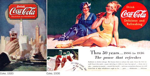
Above: Coke had already been in business for decades when the ad on the left above appeared in 1920. We don’t see the famously shaped bottle, which was designed in 1915 in the shape of a woman’s curves. Was this omission deliberate? Or did they just not think the shape of the bottle was relevant in advertising?
In the ad from 1936 on the right, we see a reference to how long Coke has been around, probably in response to market pressure from Pepsi and other brands. By tying into the history of the brand, it was the first move towards its positioning as the “real thing,” though that tagline would come some 10 years later. We also see the beginning of the red circle, and the tagline “the pause that refreshes” used in the headline.
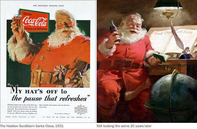
Above: Until the late 1920’s, Coke was only thought of as a warm-weather beverage. The company set out to change that image through advertising.
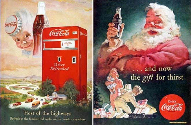
The look of Santa Claus that we’ve grown so familiar with began as Coca Cola ads in the Saturday Evening Post back in 1930. In 1931, a series of illustrations were created for the D’Arcy ad agency by Haddon Sundblom, who was inspired by the famous poem The Night Before Christmas. Sundblom’s images were so successful his work was used for the next 33 years. The timing was right for Coke, as it tied in with the new explosion of commercialism. Perhaps it was the consistency of how Coke continued to portray Santa year after year that caused this style treatment of the Santa image to be so well established around the world. Today, we can’t imagine Santa looking any other way.
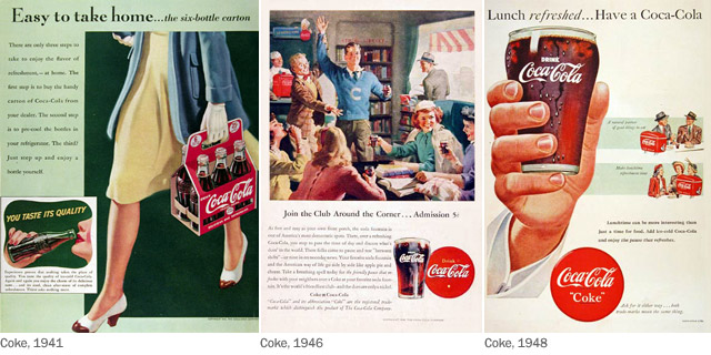
Above: In 1941, advertising began to focus on product benefits, but it was still pretty unsophisticated. Notice how the ad on the left touches on multiple themes, from convenience to taste and quality, rather than staying on one message. While the ad is unfocused, it does a good job of communicating the portability of the six-pack.
Five years later, soft drink brands were putting their emphasis on group dynamics, showing people getting together in social settings with the product as the “life of the party,” so to speak.
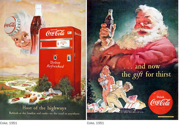
Above: In 1951, with American society buoyed by the post-war boom, two significant cultural changes seemed to impact the Cola Wars.
Automobile travel became vital to American culture. Everybody took road trips. Coke took advantage of this trend by moving rapidly into roadside vending machines and soda shops, positioning itself as the refreshment for people who loved to drive.
The second change was the growth of full color in print publications. Cheaper printing meant everything was in color, and ads everywhere now exploded in the use of full-page, full-color, full-bleed images.

Above: Meanwhile, 7-Up was floundering, with some seriously flawed soft drink advertising. These examples from 1955 and 1958 show how badly the company managed its advertising image at that time. It’s a wonder people drank 7-Up at all, given ad messages like these!
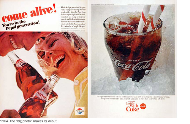
Above: These ads for Pepsi and Coke from 1964 show the emergence of modern advertising. Everyone wanted to copy the look of the famous “Lemon” ad created by Doyle Dane Bernbach for the Volkswagen Beetle that year.
The early 1960’s saw the birth of art direction, with emphasis on eye flow and carefully managed font, image and space treatment.
Notice how carefully these photographs were art directed, in order to move the eye from the type to the product or the other way around, the flow directed by the strategic positioning of those elements.
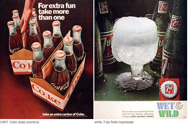
Above: 7-Up continued to struggle with pointless, silly advertising approaches. An example is the ad on the far right, from 1967, part of a lengthy “Wet and Wild” series showing inexplicable photos of glasses covered with carbonation foam. Look at the confusing body copy: “You’ve never seen anything like the taste of 7-Up. Brilliant. Absolutely brilliant.” What?
Meanwhile, Coke’s simple ad emphasized practicality with a simple message. Note the use of the Helvetica font, which was now taking the world by storm.

Above: In 1963, the Coca Cola company launched Tab, the new diet cola brand. Curiously, given the sophistication of the parent company, their advertising for Tab was a disaster, focusing on an image of upscale, snobbish users that ordinary people simply couldn’t relate to. A slogan in the 1970s touted the brand as “a beautiful drink for beautiful people.” Although there was a clear strategy around the idea of the wealthy being thin, I think the effort fell short of the mark. Who really cares if rich people drink Tab? How would that ever make it hip? Not surprisingly, while Tab enjoyed some success, especially in the 1960’s, it never fulfilled the potential for that market segment, and eventually Diet Coke would fill that niche with much greater impact.
In later years, threatened by a successful “taste test” campaign by Pepis, Coca Cola made its tragic mistake with the New Coke strategy, one that took decades to overcome.
During the next 20 years, Pepsi gained considerable ground against Coke, but the tide is turning back once again. Although Coke never lost the top spot overall, fountain sales had been significantly impacted.
Coke moved to a “Happiness” strategy offering great creative opportunities, and the brand has made the most of that potential with some truly creative advertising. The campaign has touched an emotional chord with today’s audiences, regaining market share from Pepsi. Even Diet Coke recently passed Pepsi to become the Number 2 soft drink in the world.


No Comments