
Email Design for Non-Profits

Even at the best of times, Email design is tough. With the average person besieged by countless messages every day, often unexpected or unrequested, getting people to open and read messages is a huge challenge. To cut through the clutter, design needs to be simple, clean and compelling.
For non-profits, the challenge can be even greater than for profit-making enterprises. Most non-profits are seeking either donations or involvement in activities, so their messages are even more likely to be ignored. As a result, there’s even greater value in creating interesting looking messages that are simple in their visual styling yet convey dramatic, emotional content as quickly as possible.
Having worked with many non-profits over some 27 years, the Adwiz has learned many lessons about generating responses when communicating for non-profit organizations. The Pocket Testament League, a client since 2003, is an excellent example of how good Email design can contribute to the brand identity in a powerful way. With consistent messaging over many years, the League uses compelling visual design and strong headlines to encourage Christians to read, carry and share the Word of God.
Below are some examples of messages developed by the Adwiz for the League. In addition to typical marketing messages and eNewsletters, members also receive automated messages at key points in their membership process, as well as notifications when other members interact with their online postings, and an annual birthday greeting.
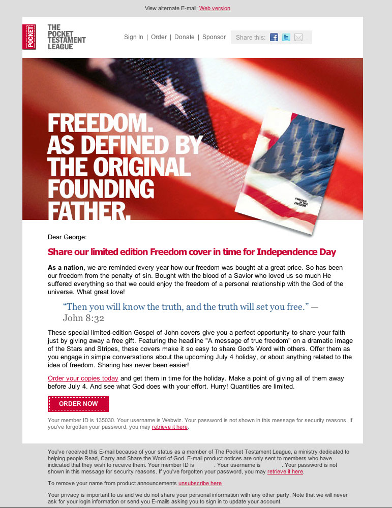
A promotional message from 2010 related to a July 4th promotion. Objects sliding outside of boundaries help create visual interest.
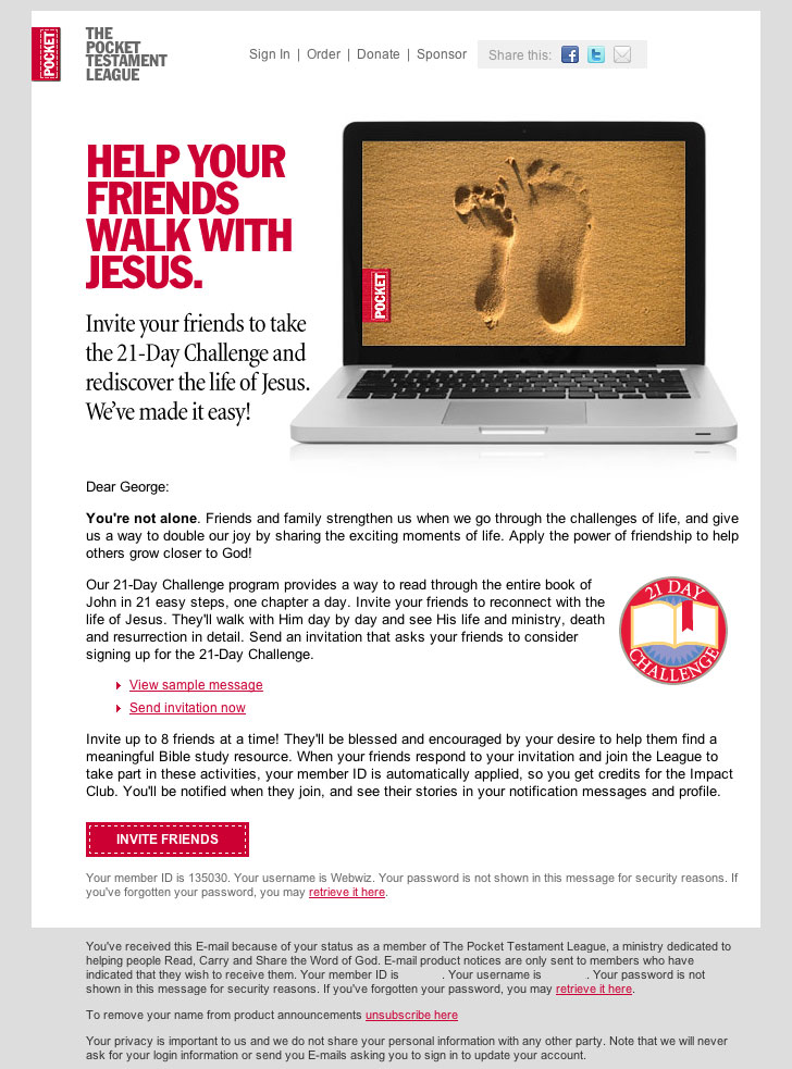
This promotional message from 2010 encouraged people to get their friends involved as members.
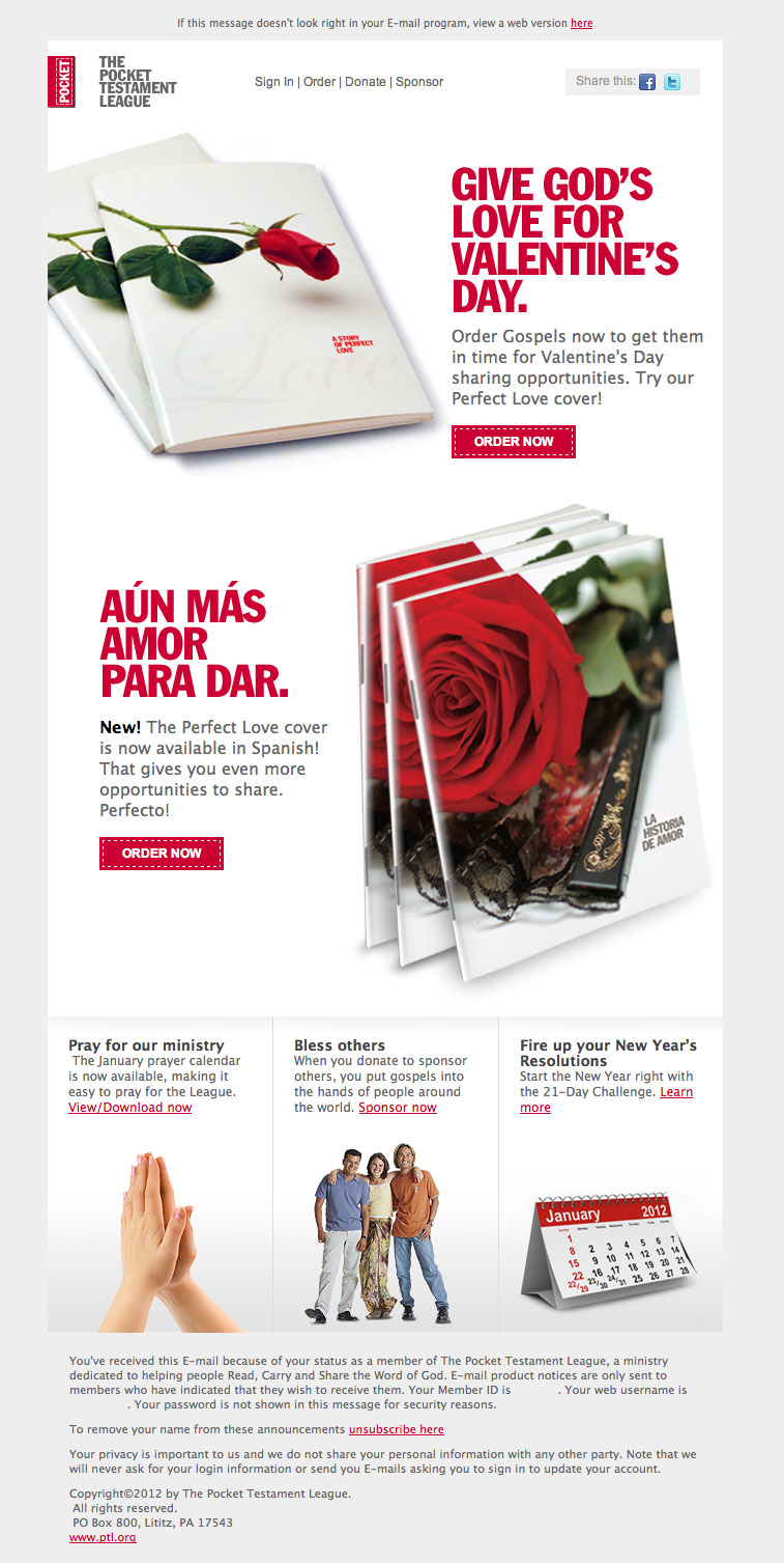
This promotional message related to Valentine’s Day uses both English and Spanish headlines to show that products are available in both languages.
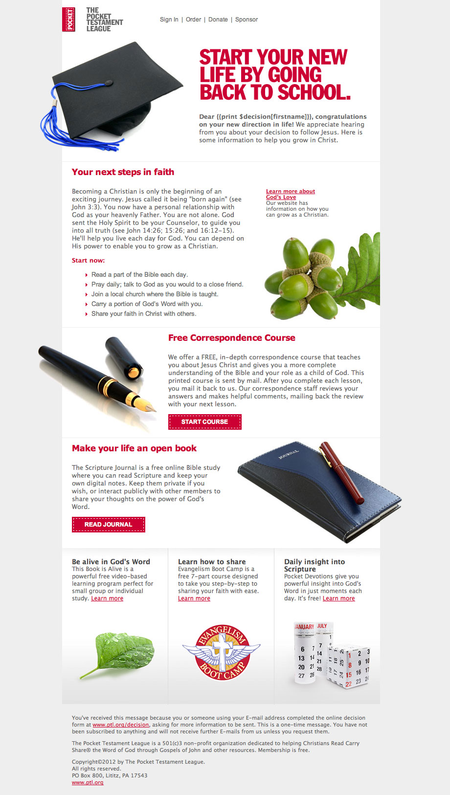
This message is automatically sent to people who fill out a form on the website. Uses images that both bleed outside the edge as well as slide behind the edge of the message, to keep it interesting and keep people reading.
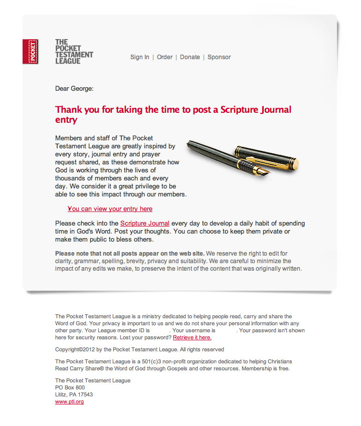
This automated system-generated message uses a friendly, casual formatting style to make the message relaxed and interesting.
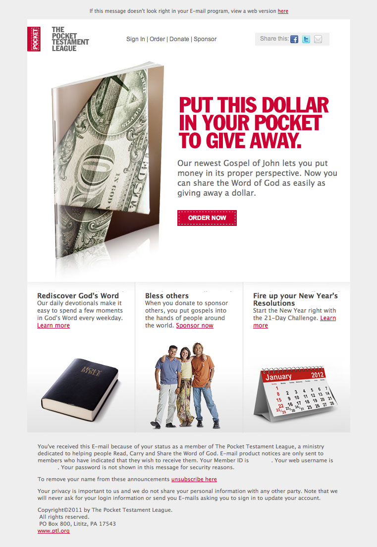
Announcement sent in 2011 for a Gospel of John with a money-oriented cover uses a headline that relates to the image and the idea behind the product.
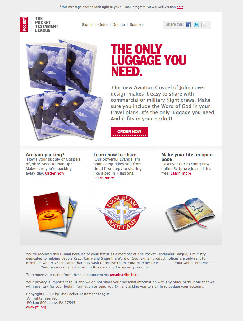
This product promotion from 2011 uses an appealing headline to link the product to how members might use it. The organization found that giving ideas for use increased orders.
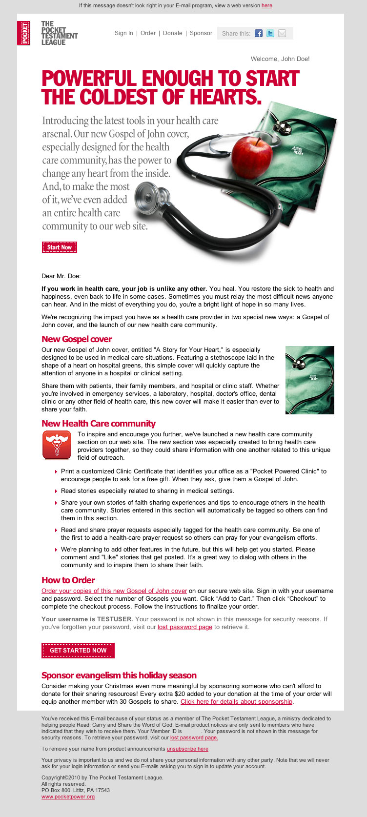
A promotional announcement from 2009 directed at people working in the health care industry. Design in later years evolved from this styling to increase readability and response rates.

No Comments