
Web design trends we’ll see more of in 2021
The past year has ushered in major changes in digital communication. With people in all demographic groups spending more time online, overall expectations for what they expect from websites will naturally change.
Facebook, an endlessly scrolling web page, got people to change their online behavior some 10 years ago. Previously they refused to scroll. I remember designing one website many years ago that had over 1,000 pages, and most of them consisted of only one or two paragraphs because nobody would ever scroll below the fold line. Enter Facebook. Today, some people will scroll for hours. Long pages work better than short ones these days, provided that the pages are well designed and contain compelling elements that relate to the needs or interests of the viewer.
Apple often leads the way in showing how new trends can be used to great effect. Here are some of the trends that have been emerging but are even more in demand because of how the pandemic has influenced our culture.
Big Text
For years, websites that had smaller text actually performed very well. Most large corporations — the brands that people trusted — used smaller text on their websites to convey professionalism and a sense of stability. As a result, large text was usually seen as unsophisticated. That has changed a lot. Today, large headlines are commonly used by the best sites. Massively oversized individual letters and short text can be effectively used as graphical elements.
Of course, it has to be done well. Large text needs to be balanced with proper use of negative space to convey the impression that the design is sophisticated and deliberate.
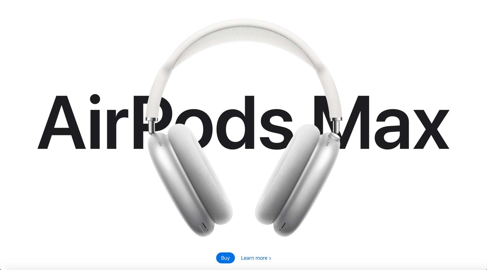
Above: The Apple site does a great job of applying some of the latest trends, so it’s a great source of inspiration. Here, the product name is stretched across most of the screen, and at the same time treated as a graphical element with the overlay of the product image.
Oversized Images
Like the use of large text, images are also getting bigger. With most people on high-speed connections, concerns about bandwidth are less of an issue. Modern compression techniques and new web image formats are so good that you can now create full-screen images at smaller file sizes than we used to manage with tiny postage-stamp pixel dimensions. And they look better than ever.
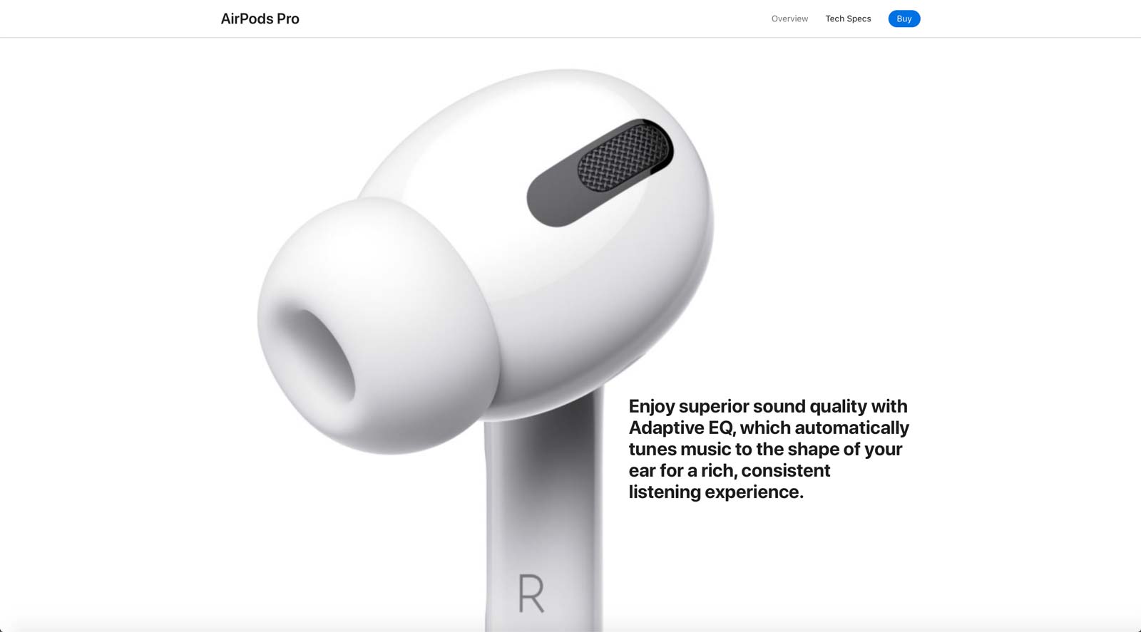
Above: Again from the Apple site, products are sometimes shown at many times their actual size, creating great presence. The use of subtle animation further contributes to the visual appeal.
Curved Shapes
We were already seeing more use of curves and organic shapes, and that trend has grown stronger. The use of curves is a nice contrast to the highly structured rectangular lines seen for decades all over digital content. The challenge is to use unusual shapes well. It’s easy for web design to get messy and disorganized when shapes are used without enough understanding of eye flow and visual balance.
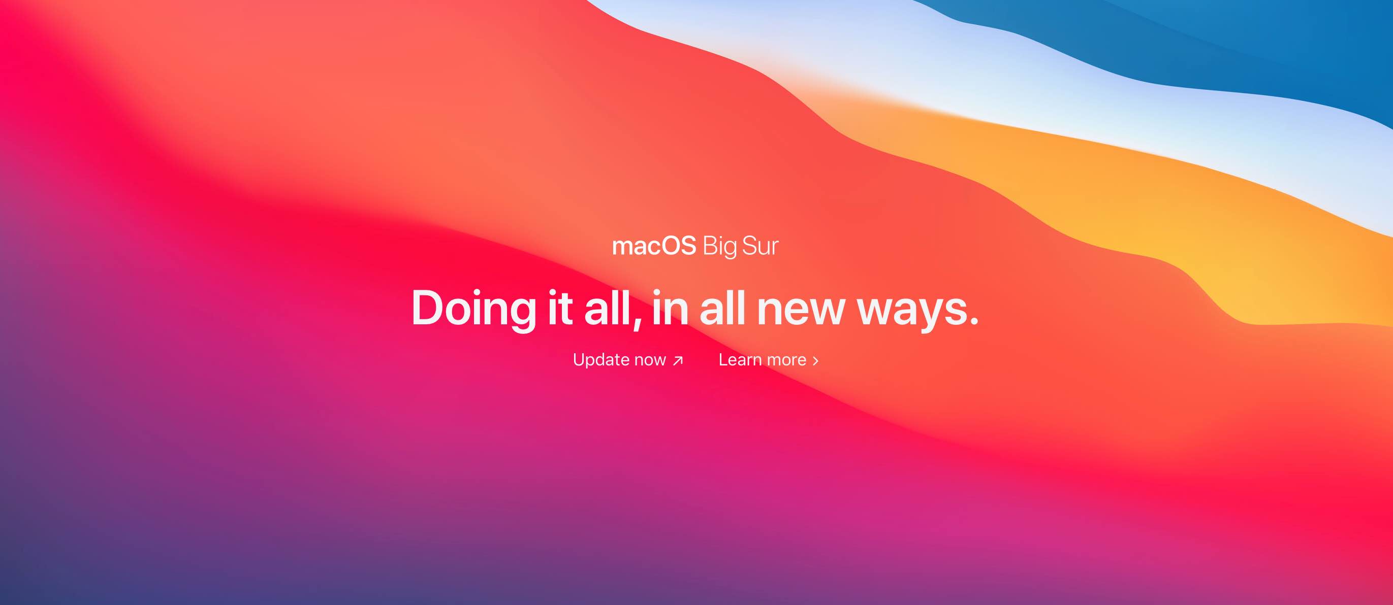
Above: Apple’s new MacOS, Big Sur, utilizes curved shapes in multiple ways, including this cool graphic used on the start screen. Curves help to soften and humanize screens that are generally filled with linear lines and sharp angles.
Boxed Content
For many years, larger screen sizes meant that web site designs expanded horizontally. Sites were full of wide blocks that stretched across the width of the screen. And this looks great. The downside is that it’s so common it’s often the anticipated look. As a result, we are now seeing more use of these wide screens to put boxes side by side, creating interesting layouts. This approach allows the eye to move in a zigzag pattern down the page as it moves between the boxes.
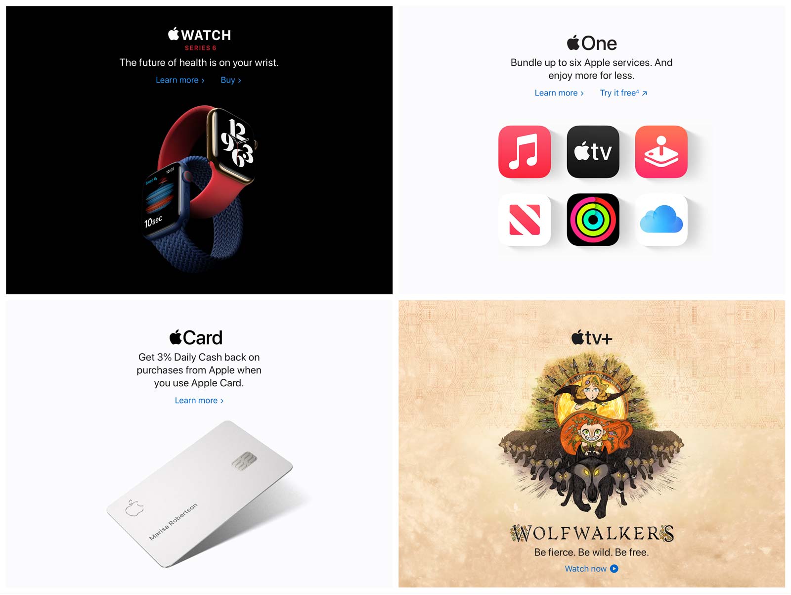
Above: Another evolution seen to great effect on numerous sites is the use of side-by-side boxed content, creating visual interest and allowing beautifully managed eye flow in a zig zag pattern.
Personal Touches
More than ever, people are expecting sites to personalize content. Of course, this isn’t possible, or practical, for a typical business site. Instead, make use of handwritten text, signatures of key people, as well as bios to add humanity to the website. Handwritten text looks great and adds a beautiful organic quality.
Photos don’t have to be studio-quality, either. There can be great impact using casual-style images that look more natural. Play with grain and blur to make images look even more interesting.
However, it’s just as important as ever to involve professionals in the process as they have the ability to shoot or select images that create the right kind of emotional connection that’s vital in building trust and user involvement.

Above: The use of handwritten elements adds humanity and an organic quality that acts to personalize a site even when you can’t use personalization.

No Comments