Great new packaging for Christie Potato Thins

I don’t generally eat junk food, not even low-fat junk food, so I normally walk right by the stands these packages sit on without a second glance. But I had to stop and take a closer look when I saw the new packaging design for Potato Thins, a kind of snack cracker from Christie.
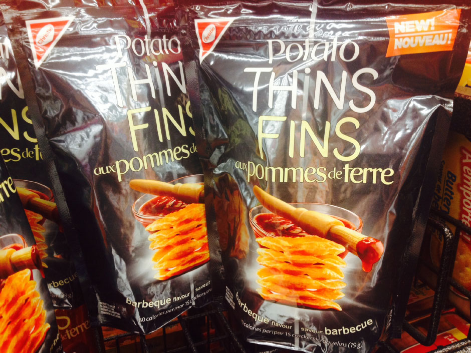
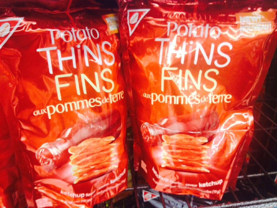
The packaging is beautiful! Each flavor features a full-color, full-bleed wrap in an appropriate metallic ink color, with a nicely Photoshopped representation of the flavor source and a stack of the Potato Thins themselves in the foreground.
I especially like the thin line that extends vertically all the way down the center of the package, forming the “i” on the word Thins and thus emphasizing how thin they are by making you think of what “thin” means. Brilliant design and surprisingly minimalist, especially considering Canada’s ungainly bilingual requirements.
The “Barbecue” flavor packaging is shown above. Here’s what the “Ketchup” flavor package looks like:


No Comments