When big brands look desperate
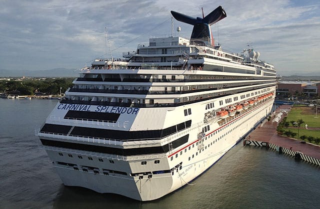
My fascination with branding doesn’t turn off just because I’m on vacation. So I couldn’t help but notice a major brand identity gaffe when a Carnival Cruise Lines ship pulled into the dock at Puerto Vallarta, Mexico. This is at first glance a beautiful ship, and an impressive site as it pulls into the harbor. Unfortunately, the desperation visible in the company’s brand identity gives the impression of a weak, disorganized company. Not only is the name of the line and the ship plastered everywhere (I counted 7 places) but it’s applied in such an amateurish way one can’t help but wonder if the company has any credibility at all.
Take a look at the name on the back of the vessel above. The name screams to be noticed, as if the ship itself wouldn’t be. The type is way too big. Instead of using white space intelligently to show class, the name fills every inch of available vertical space. What should be beautiful becomes ugly. It speaks of a lack of confidence, of a company that feels it has to scream at people to be heard. Leaders don’t shout.
Just as bad, there’s no font. The letters look like someone used blue strips of tape and just kind of stuck it in place. The impression is one of desperation. Instead of looking like a company that manages its brand, and by extension, its other affairs, one is left with the impression that nobody is really in charge.
If the ship can be made so ugly on the outside by unnecessary and bad brand identity, what else is ugly on the inside? A ship that must have cost between $500 million and $800 million to build is reduced to looking like a badly designed 30-foot fishing trawler, all because of a terrible branding decision. After seeing this, I wouldn’t want to take a chance with Carnival. I’ve seen everything I need to see about this brand.
When you study the top brands, you find a remarkable sense of control and consistency not only in how the brand identity is used, but in how well it relates to the character of the company. This is the essence of branding: ensuring that all aspects of your message, from signage to marketing and yes, even to how the company vehicles are appointed, match the personality of the company. There’s incredible strength in consistency and organized management of the brand identity.
In the case of Carnival, the signage on the ship contrast so sharply with one’s expectations of how a luxury cruise ship should look that the brand loses all its credibility. In essence, the signage actually has the opposite effect from what was intended.
No Comments