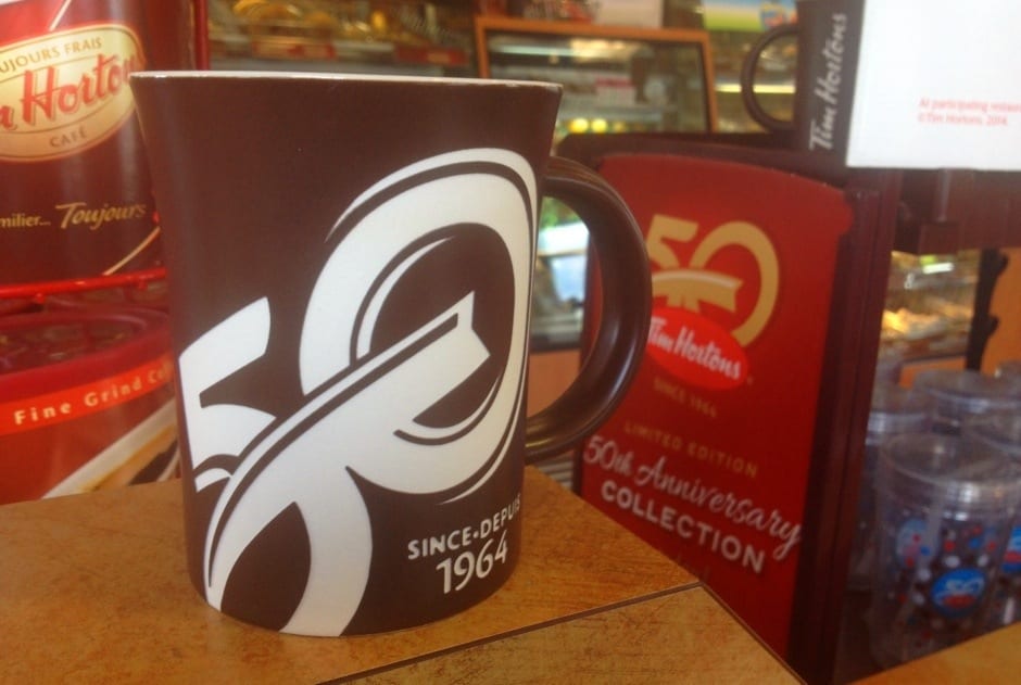
Tim Hortons brand hits 50 with style
I like how the Canadian food chain Tim Hortons has been putting energy into its 50th anniversary. For example, here’s how they created a buzz around the milestone with a promotional event captured in a very effective video:
50 years is a pretty big number for a company to reach, so it’s one that generally gets some worthy attention. But not all companies do it well, and Timmy’s (as it’s commonly known in Canada) has done a great job.
I find that few restaurant chains are consistent in their brand character. Most seem to do little more than throw different things out there, hoping some of them stick. That just ends up looking desperate. This is unfortunate, because it ends up creating a lot of noise without substance. In our over communicated world, the only hope a brand has is consistency.
Tim Hortons has a warm, likable brand personality. It shows through consistent brand voice in its advertising and graphic design. Ad messaging is distinctly Canadian and comes across in a friendly way, feeling like a relationship with a good neighbor.
The 50th Anniversary logo has clean, flowing lines that nicely reflect the curve of the logo oval. With just two colors — an appropriate gold and Timmy’s logo red, the anniversary logo stands out on its own without competing in any way with the brand entity itself. What’s particularly effective is that the logo can be embedded within the 50th anniversary graphic without taking anything away from it. The two complement each other that well. Nicely done.


No Comments