Gap’s logo disaster a lesson for all brands
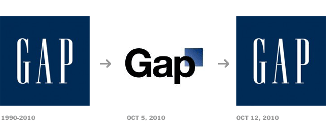
Clothing retailer Gap learned a useful lesson in branding last week, and I hope it’s one that other brands will take to heart. After the company revealed a new logo just one week ago, public response was so overwhelmingly negative the brand took the unusual step of announcing yesterday that they were going back to the old logo.
Over more than two decades in this business, I’ve seen many companies decide that their logo needs to be changed. Typically, it follows the hiring of a new president, CEO, or marketing VP. In an effort to mark his territory, he convinces corporate brass that the old logo is “tired,” and commissions a new one. Out the window flies all the equity invested in the old corporate identity.
There’s a kind of flippant “so what” attitude among many corporate leaders about the logo, as if it’s no more important to the brand than the color of the carpeting in the lobby. Statements are made about how people are “tired” of it, thinking that everyone else sees it as often as they do. Your customers care more than you think, even if they aren’t aware of it. But not because they see it so much. They care because it gives them a sense of comfort and familiarity about the products they buy. They have something invested in your logo, just like you do.
 GAP’s decision led to an unusual level of response. In fact, I was surprised by the level of interest, because I didn’t think the brand had that much support. Within 24 hours of introducing the new logo, one blog had 2,000 negative comments and only 30 people who liked it. A third-party website, Crap Logo Yourself, quickly sprang up to let you make your own “Gap-style logo,” like the one shown here.
The company’s explanation for changing the logo was exactly the same kind of thing I’ve heard countless times. Gap’s announcement following the uproar said, “We’ve had the same logo for 20+ years, and this is just one of the things we’re changing.” Asked what the company liked about the logo, VP of corporate communications Bill Chandler said, “We believe this is a more contemporary, modern expression. The only nod to the past is that there’s still a blue box, but it looks forward.” It seems that customers didn’t feel they wanted to move forward quite that way.
How to change a logo
There’s nothing inherently wrong with asking if your logo needs to be refreshed. At times this is necessary to reflect changing cultural realities or changes in the brand’s focus. But complete overhauls are usually unwise.
Logos have equity. The longer a logo has been in circulation, the more power it has. This has nothing to do with whether or not the logo is ugly or beautiful, but with the way it becomes linked to the brand. Consider the value of the Mercedes Benz three-pointed star, or the Apple logo. While they might be updated with slight modifications, they are never “changed.” Making a significant change is essentially throwing out everything people associate with the company and starting over. I’ve never understood how otherwise intelligent corporate leaders can simply go along with those kinds of initiatives.
The Starbucks logo has gone through a couple of updates, which were needed to reflect serious issues that the logo faced. But each change was an intelligent one addressing a particular problem and only that problem. The essence of the symbol didn’t change. The same was true for many other successful overhauls.
Strong logo updates
UPS

Consider the change made by shipping giant UPS a few years ago. In the redesign, they cleverly stayed with the same structure, just bringing the look into modern times with a 3-D effect and some color. While the brown tones are ugly, the company wisely stayed with those colors because that color scheme has been in use for a long time and already has equity. Changing the company’s color scheme would have lost more ground than it would have gained.
AT&T

AT&T is another example of a company that made only the necessary change to reflect the times we live in. The essence of the logo stayed the same. The font was changed slightly, but not so much that it became unrecognizable. Only graphic designers are even likely to notice that the font changed at all.
Pepsi

Pepsi recently overhauled its logo, and again we see only a minor change, tilting the wave to form a grin. Though somewhat controversial for a variety of reasons, most people have accepted this new look. The font has also been updated to look lighter and more modern.
Poor logo update: Seattle’s Best Coffee
Consider, on the other hand, the case of Seattle’s Best Coffee:

This brand has enjoyed consistent growth in the Pacific Northwest, competing against the giant Starbucks brand quite effectively. Their old but classy logo spoke of tradition and the ritual of a hot cup of coffee in the morning, evoking thoughts of coffee traders plying the oceans and jungles of the world to find the richest tasting coffee beans.
In sharp contrast, the new logo has none of those qualities. Indeed, it has no qualities at all! This is an example of throwing out the baby with the bathwater. Did they really need a new logo? That’s something I can’t answer. But I’m quite sure that what they came up with is not going to help the brand. This lifeless identity is devoid of any character at all.
Perhaps you feel your logo needs an overhaul. Don’t be so quick. Chances are the only one tired of seeing it is you. You’ve had to look at it all day long, every day of the week, possibly for many years. Your customers are lucky to get a quick glance once every few days. Even the most fanatical fans of your brand probably only see it for a few seconds each day. And they get a sense of comfort from what it means to them. Think long and hard before you make a mistake that can cost you.
No Comments