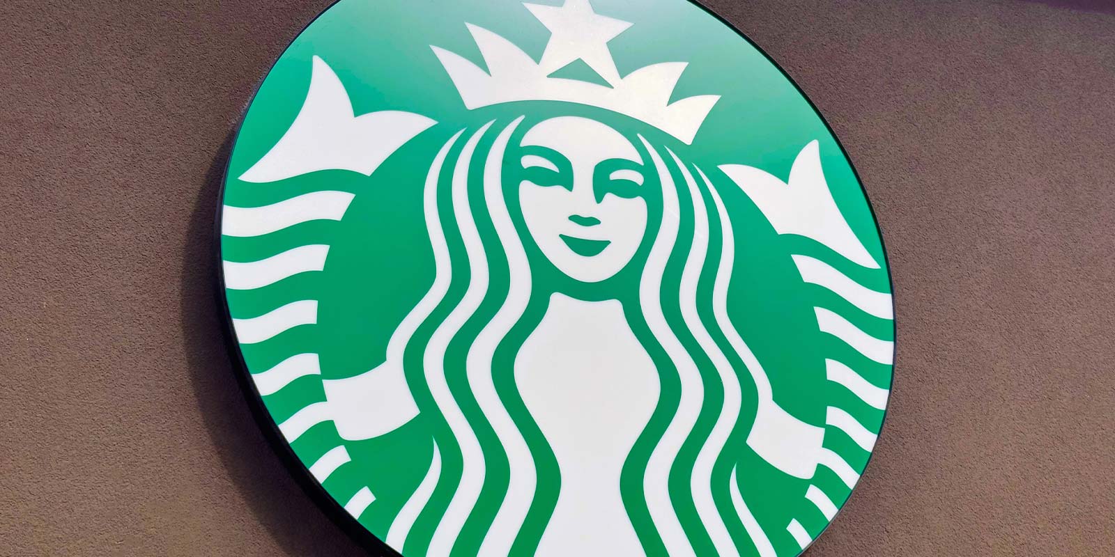
Starbucks shows how to change a logo
Over my 30 years in the business of working with branding communications, I’ve seen great logo upgrades and terrible ones. We’ve also seen plenty of disasters like the recent GAP logo fiasco. Today, Starbucks launched its first look at their new logo transition and it’s a great example of how a logo change should be done.
 First, let’s consider the logo itself. The Starbucks logo of the siren has a long history. When Howard Schultz first got in the coffee business, it was through a company called Il Giornale, which was based on a real Italian espresso bar concept. The Il Giornale logo was a circle with a stylized siren head, the name inside a band and stars to fill in the space. The Starbucks logo, dating back to 1971, was surprisingly similar. It featured a mermaid siren wearing a crown, with the name in a circular band around the outside.
In 1987, Schultz bought Starbucks — then a coffee bean roaster and retailer — and merged it with Il Giornale, keeping the Starbucks name and logo. The bare chest on the siren made people uncomfortable (see the evolution below), so he quickly had a more professional version created which used her hair to cover the chest, although the belly button was still visible. He also added two stars as had been used on the Il Giornale logo, with a stronger and bolder typeface.
Over the next few years, it became apparent that further changes were needed to make the logo less suggestive, so in 1992, when the company went public, the siren was cropped more closely, but otherwise unchanged. This was an excellent way of dealing with necessary change while retaining the essence of the brand identity.
In Spring of 2011, the company will essentially keep the center of the logo and make that the entire logo. It’s a brilliant move. It allows the logo to stand on its own without the name, thus permitting expansion into areas that might move beyond coffee. The company already serves food and beverages such as smoothies that are not coffee-related, so this makes perfect sense. Nothing in the image itself has been modified, a superb touch that makes me respect the brand more than ever.
Further, the company has given the public a heads-up about the change, and posted a web page with a video talking about the upcoming change. See it here.
Schultz makes a point of explaining that, while the logo does give the option to move beyond coffee, Starbucks will remain primarily a coffee company. This kind of open communication is so necessary in our current culture of transparency, and a classic touch for this classic company.
What I find so great about this change is how little has changed. This is hard for many marketers and corporate executives to grasp, because they often feel that you need to come up with something new all the time. It takes great wisdom and restraint to hold back the reins of change in order to retain the familiarity that keeps the momentum of a brand moving forward. Kudos go out to the entire marketing team for doing such a great job on this transition. I hope more companies learn from this and apply similar thinking when they upgrade or change their logos.


No Comments