Branding
Eaglecom Branding
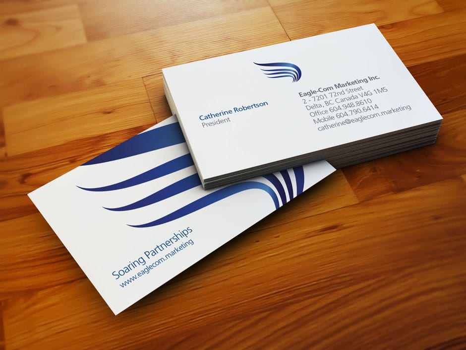
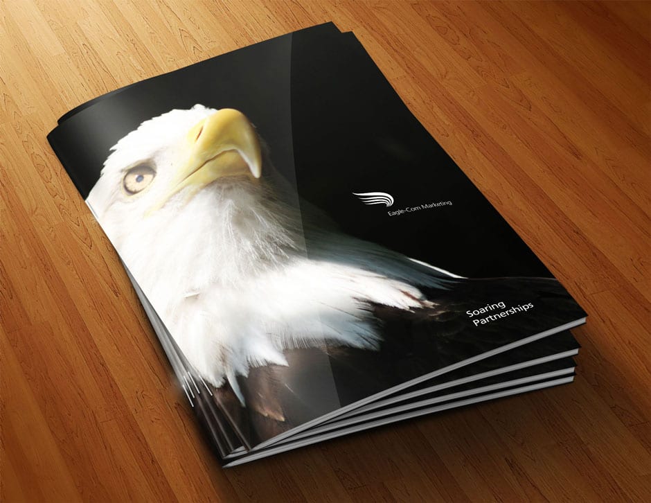
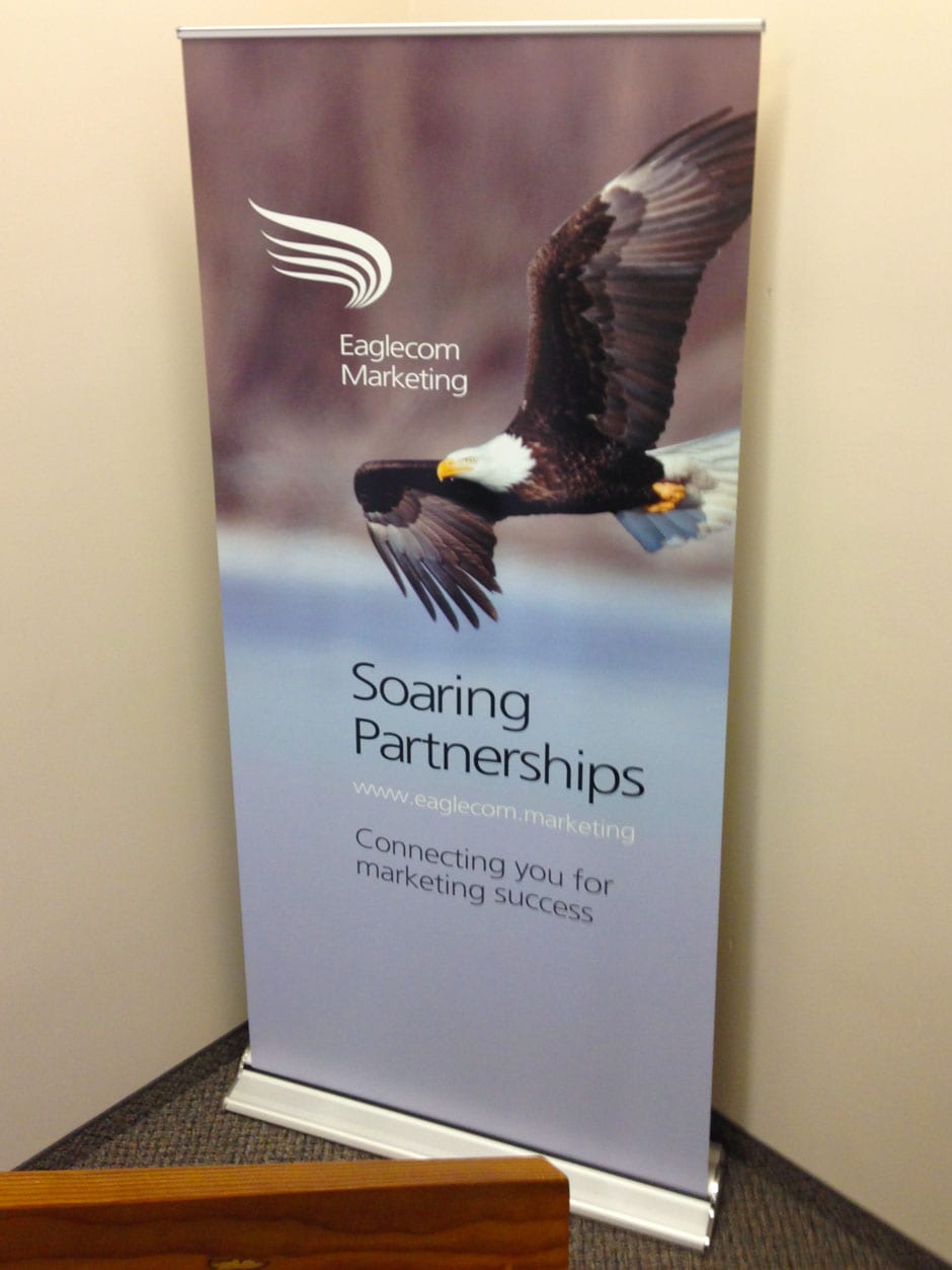
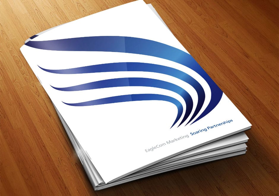
Eaglecom Marketing needed help with a brand identity. Their logo at the time consisted of a clip art eagle graphic that a staff member had set up many years earlier and a refresh was essential. I wanted to stay with the concept of an eagle for obvious reasons, but not a graphic of an eagle because that would be too dull. Ultimately I was able to stylize the tips of an eagle’s wings to create the letter E in a beautiful shape that soars and appears to move on its own.
Client:
Eaglecom Marketing


